
Official boundaries
Boroughs use INEGI's geostatistical framework; in your system they can be neighborhoods, sectors or your own patrol areas.
Interactive simulation
The same set of incidents tells different stories depending on how it is drawn. Switch between official boundaries, patrol sectors, hexagons, clusters and coverage radii, and draw your own area to measure it.
Borough polygons
Choropleth over the official boundaries of the 16 boroughs.
5,175 incidents with current filters
Incidents per area
Boroughs with the most incidents
Fictitious incidents on real OpenStreetMap cartography. Borough boundaries: INEGI. Use Ctrl or Cmd + scroll to zoom.
Boroughs use INEGI's geostatistical framework; in your system they can be neighborhoods, sectors or your own patrol areas.
Each cell has a code so it can be assigned to a shift or a unit.
The share of incidents within each base's radius is recalculated as you move bases or change the radius.
Any polygon you draw becomes a filter for reports, alerts or geofences.
Simulation with fictitious data that runs entirely in your browser. The real system is configured with each institution's catalogs, roles and integrations.
More simulations
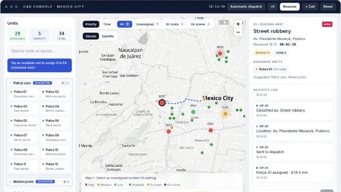
Take incoming incidents, dispatch units on the map and track response times in real time.
Open simulation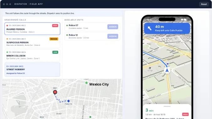
You assign the call from dispatch and the unit's phone receives it with turn-by-turn navigation to the scene.
Open simulation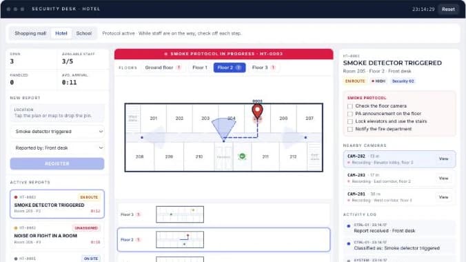
Drop the incident pin on the map or on each floor plan, assign the nearest staff member and follow the protocol.
Open simulation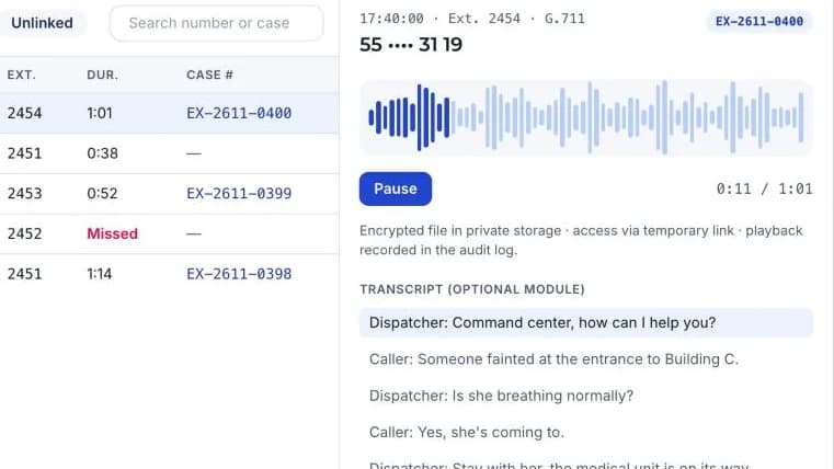
Live extensions, recorded calls, a filterable call log and a player linked to each case number.
Open simulation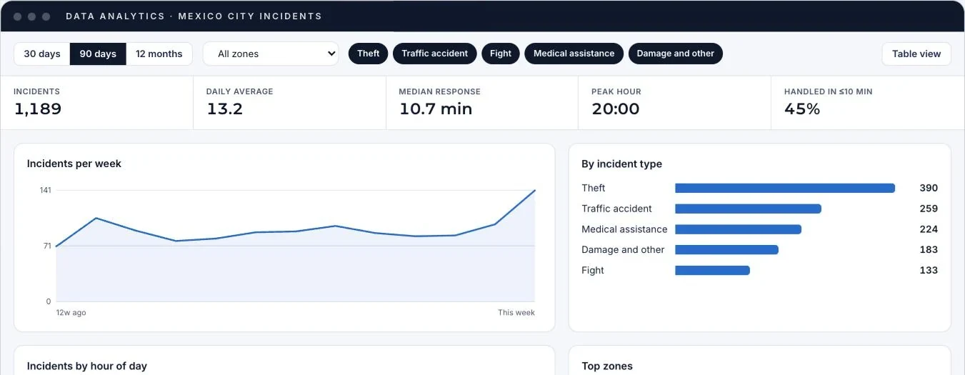
A dashboard with trends, incident types, peak hours, areas and response times, with filters and a table view.
Open simulation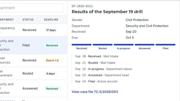
Mail intake, routing and deadlines, case files with a classification scheme and reports, like a records ERP.
Open simulationWe set up a demo with the catalogs and real cases from your operations.