
Key indicators
Total, daily average, response time and peak hour at a glance.
Interactive simulation
The data your daily operation generates answers concrete questions: when incidents spike, where, what type and how quickly they are handled. This dashboard shows it with a year of sample data.
Fictitious data generated for this demo (4,200 records). In the real system it is fed by the CAD.
Total, daily average, response time and peak hour at a glance.
The matrix shows which days and hours carry the heaviest workload.
Side-by-side comparisons to put resources where they are needed most.
In the production system the dashboard feeds directly from case records and exports for reporting.
Simulation with fictitious data that runs entirely in your browser. The real system is configured with each institution's catalogs, roles and integrations.
More simulations
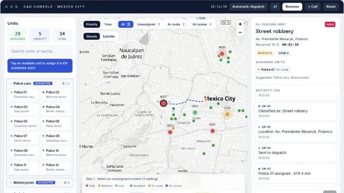
Take incoming incidents, dispatch units on the map and track response times in real time.
Open simulation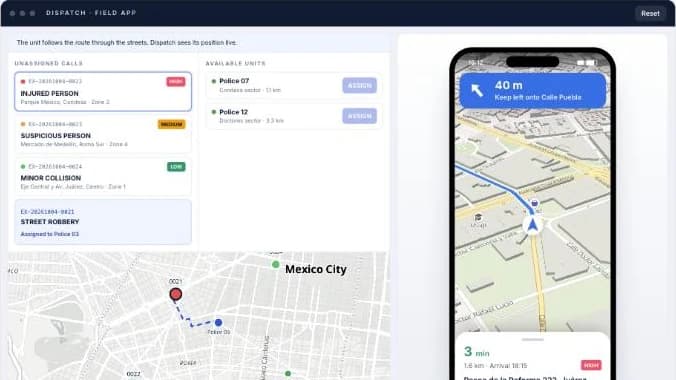
You assign the call from dispatch and the unit's phone receives it with turn-by-turn navigation to the scene.
Open simulation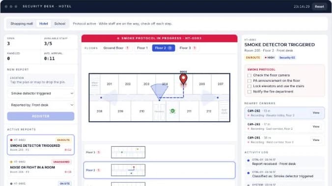
Drop the incident pin on the map or on each floor plan, assign the nearest staff member and follow the protocol.
Open simulation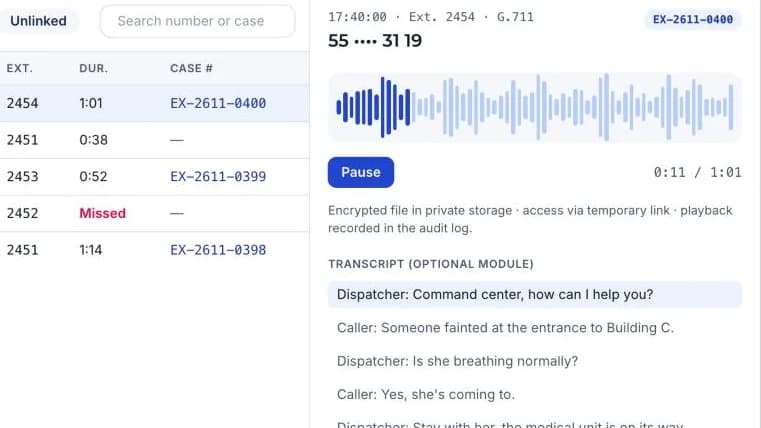
Live extensions, recorded calls, a filterable call log and a player linked to each case number.
Open simulation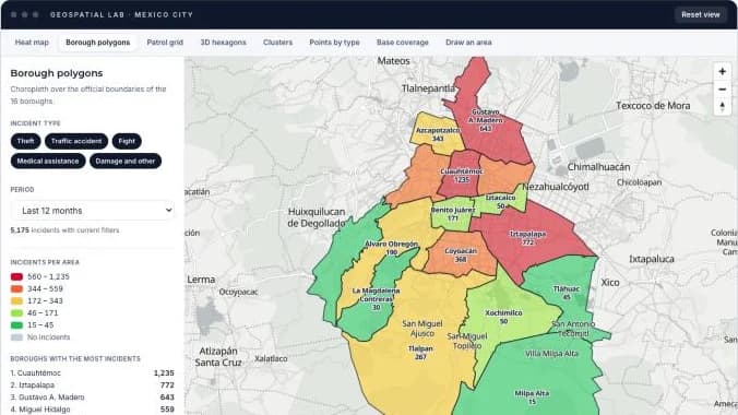
A heat map by hour of day plus seven more ways to read the same incidents: borough polygons, patrol sectors, 3D hexagons, clusters, base coverage and areas you draw yourself.
Open simulation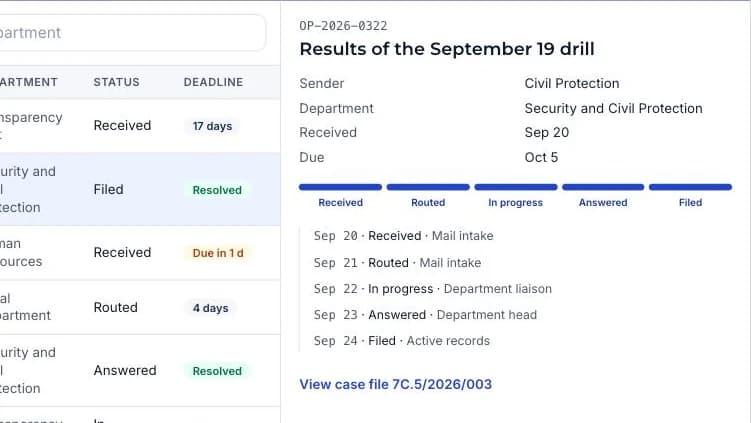
Mail intake, routing and deadlines, case files with a classification scheme and reports, like a records ERP.
Open simulationWe set up a demo with the catalogs and real cases from your operations.